The Refinery Church
DELIVERABLES:Brand identity
INDUSTRY:Religious organization
YEAR COMPLETED:2021
The Challenge
The Refinery Church in Temecula, California needed a distinctive brand identity that reflected its mission while remaining approachable and relevant to a diverse audience. The goal was to combine natural inspiration with a contemporary, welcoming aesthetic.
The Solution
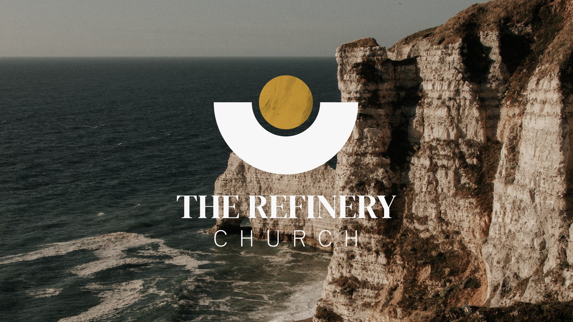
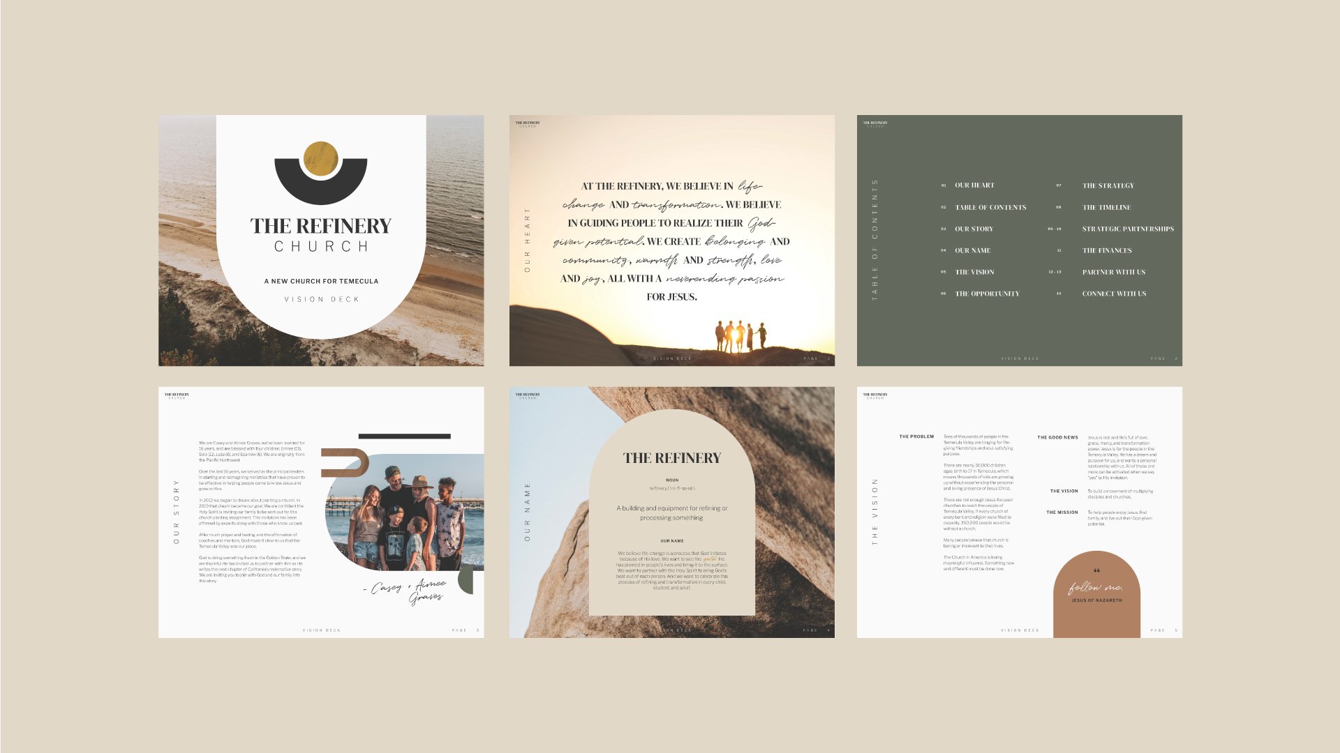
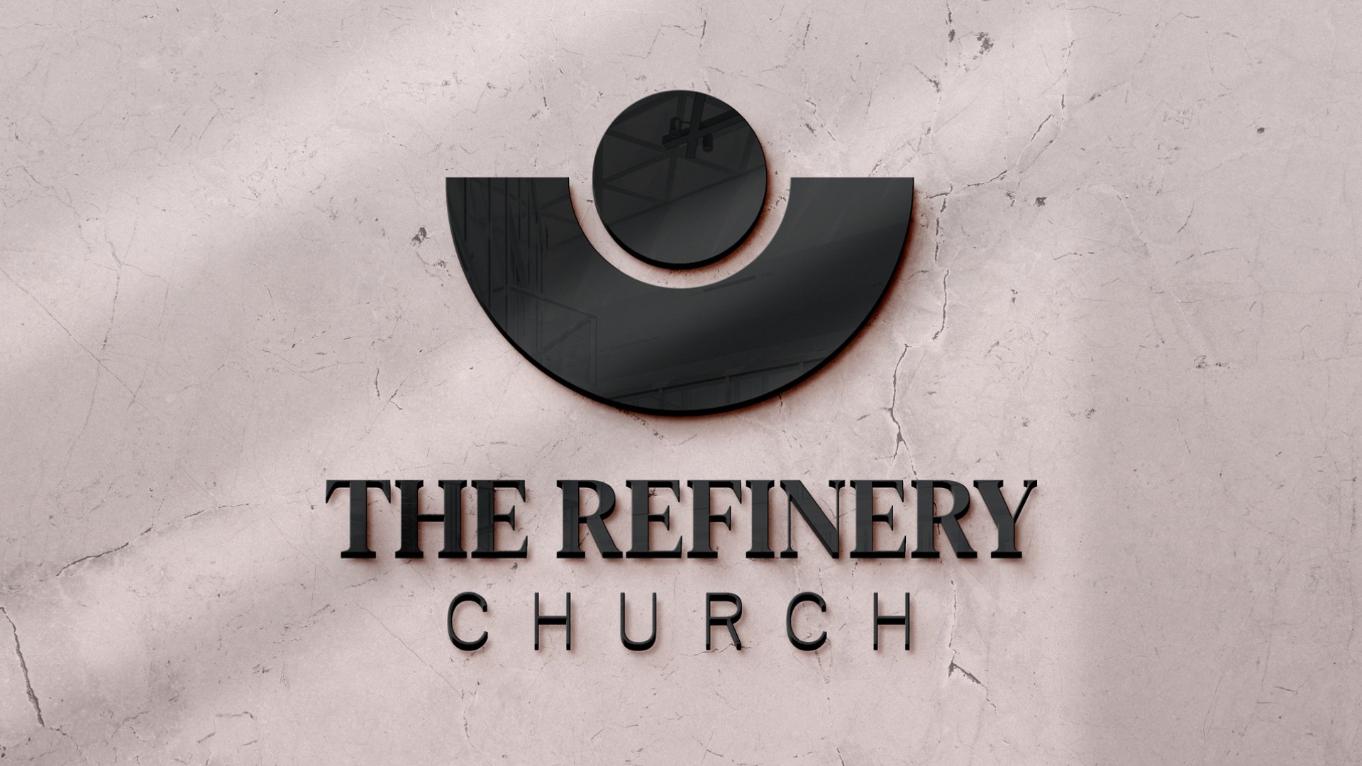
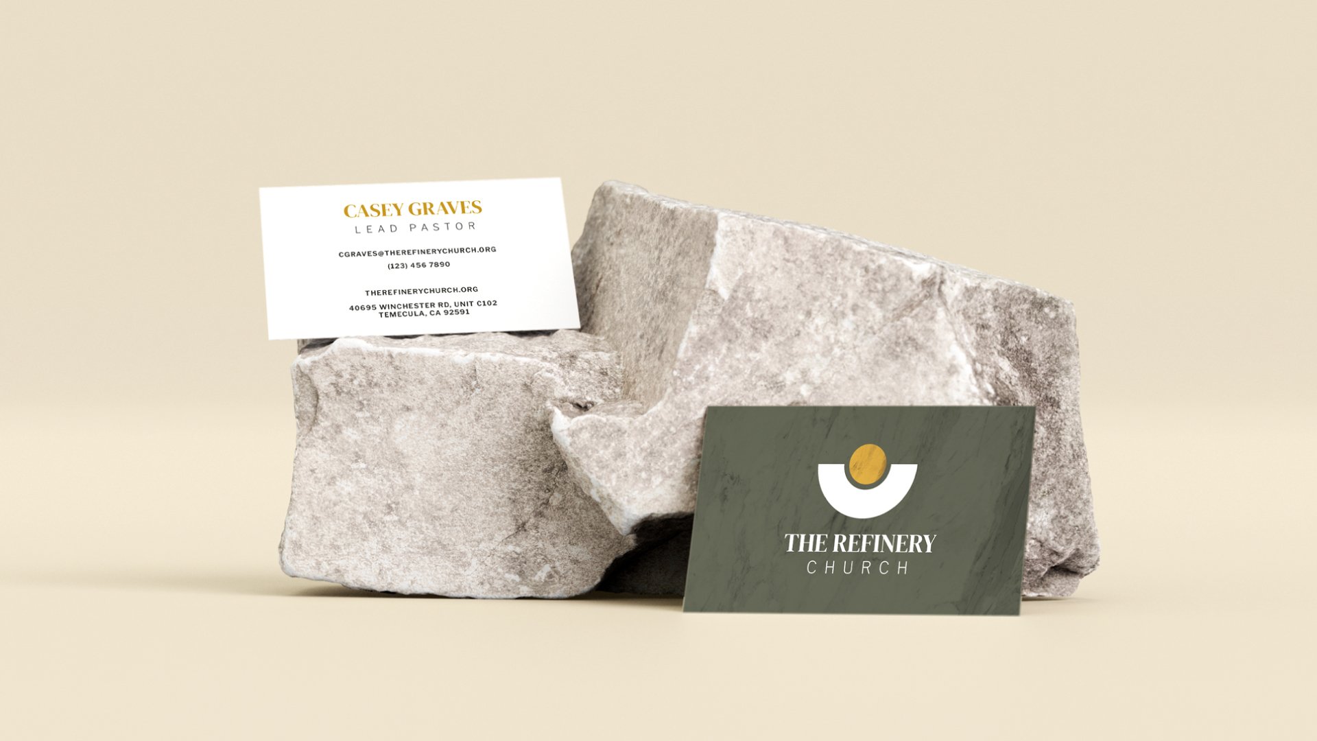
The identity uses warm, neutral colors and stone-inspired textures, paired with modern geometric elements and a mix of contemporary and traditional typography. This combination conveys strength, approachability, and timeless appeal across all touchpoints.
The Result
The refreshed brand positions The Refinery Church as a modern, inviting sanctuary. Its visual identity balances warmth and strength, creating a welcoming presence that resonates with people of all ages and backgrounds.




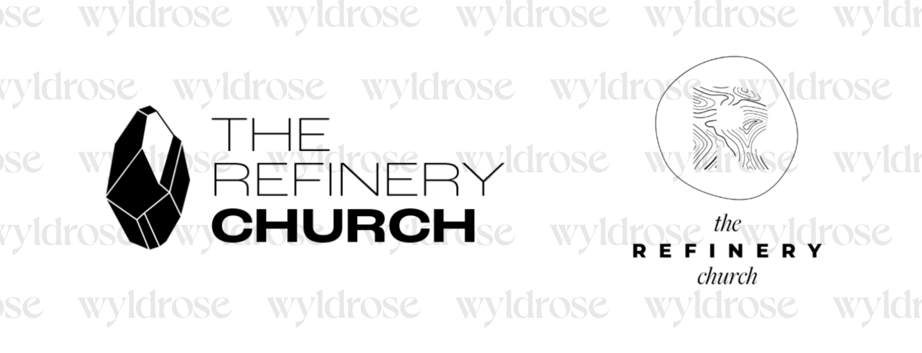
Unused Logo Concepts