EvernodeAI
DELIVERABLES:Naming, brand identity, collateral design, UI design
INDUSTRY:Software
YEAR COMPLETED:2023/2024
At the heart of GTMA's evolution lies the creation of EvernodeAI, a testament to the company's commitment to pushing the boundaries of SEO and digital marketing. EvernodeAI emerged from the convergence of advanced AI technologies and GTMA's deep industry expertise, designed to offer detailed analytics, continuous website optimization, and a 'living' dashboard that adapts to the ever-changing digital landscape.
The Name
The name “Evernode” is a fusion of ever and node, hints at our tool’s prowess in SEO. It suggests an enduring, interconnected digital ecosystem of optimized content and strategies. The name implies ongoing refinement of online presence, guided by the term “ever.” It implies our tool leaves a lasting mark, fostering sustained online success and inspires perpetual improvement. “Evernode” implies that the tool enhances digital marketing initiatives though smart connections and syncs online facets for optimal outcomes. In essence, “Evernode” captures an AI tool shaping an enduring digital network, fostering growth, excellence, and lasting impact.
The Visual Identity
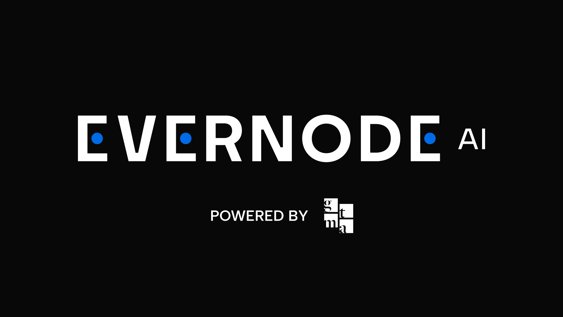
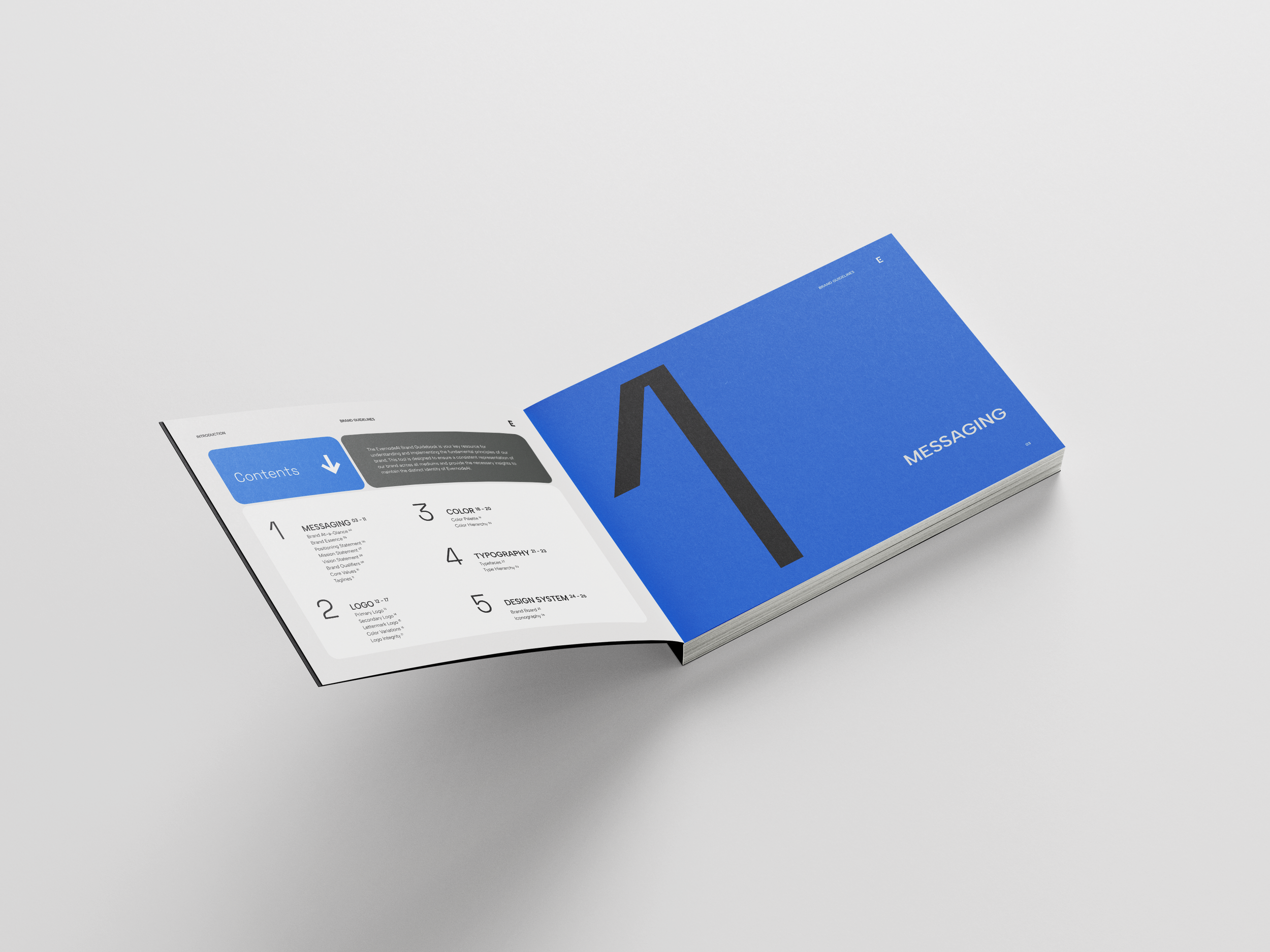
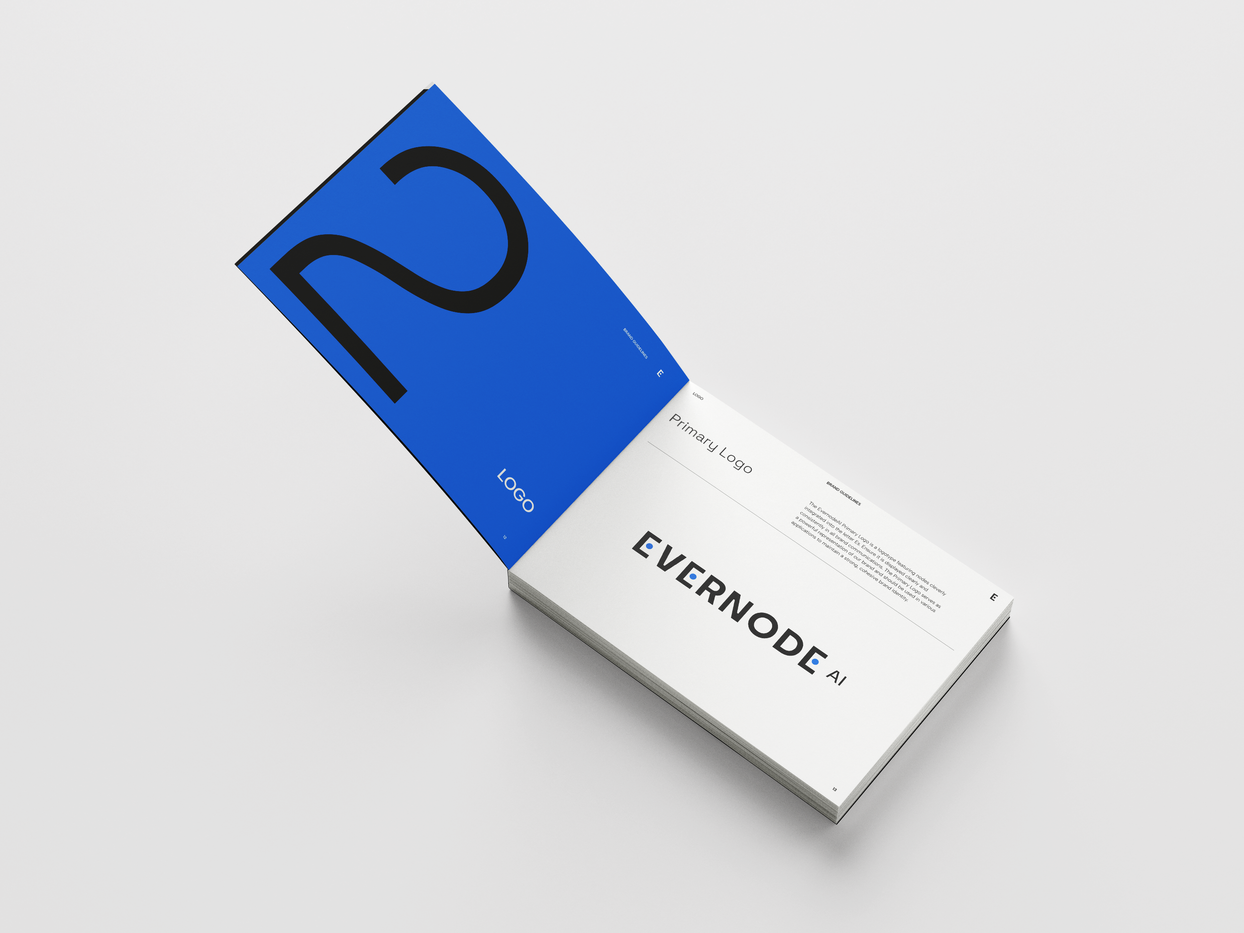
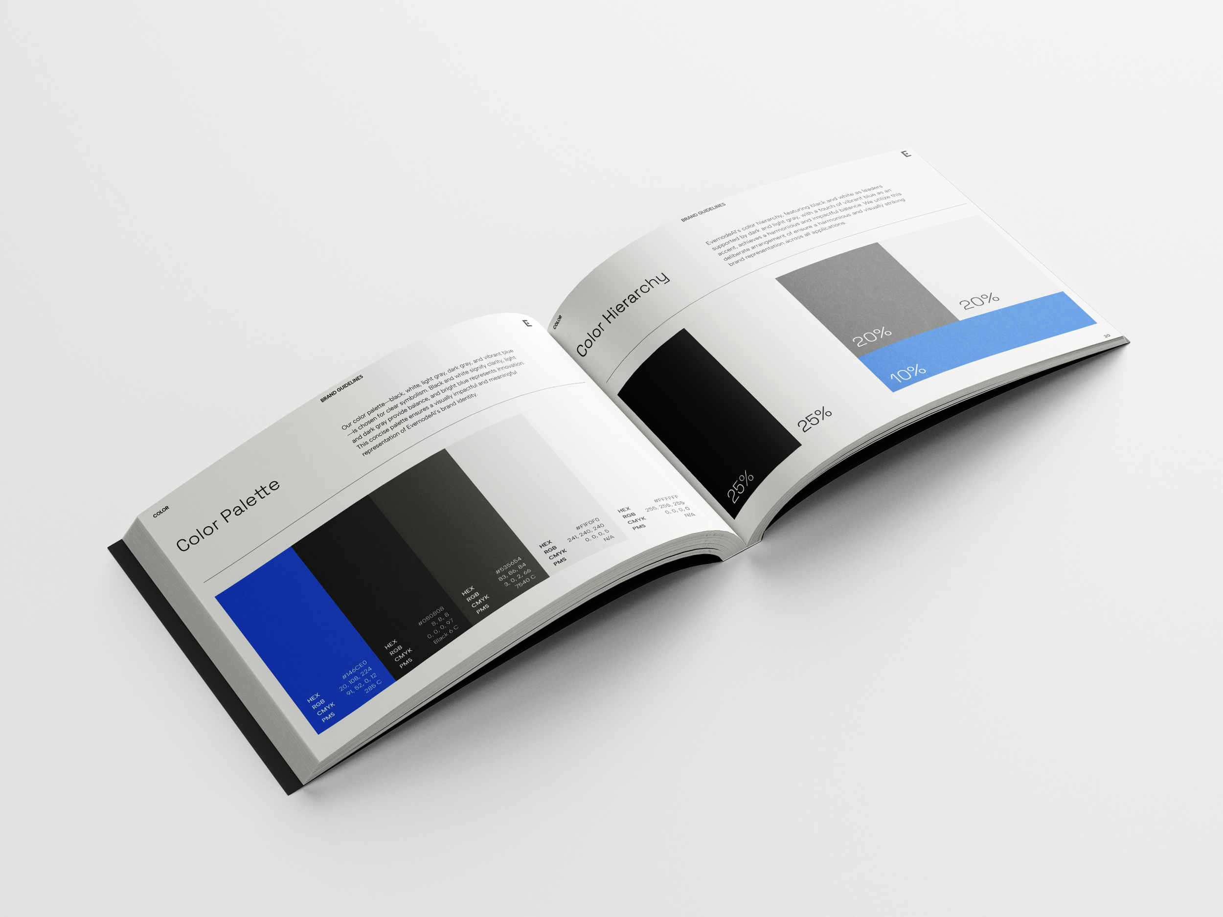
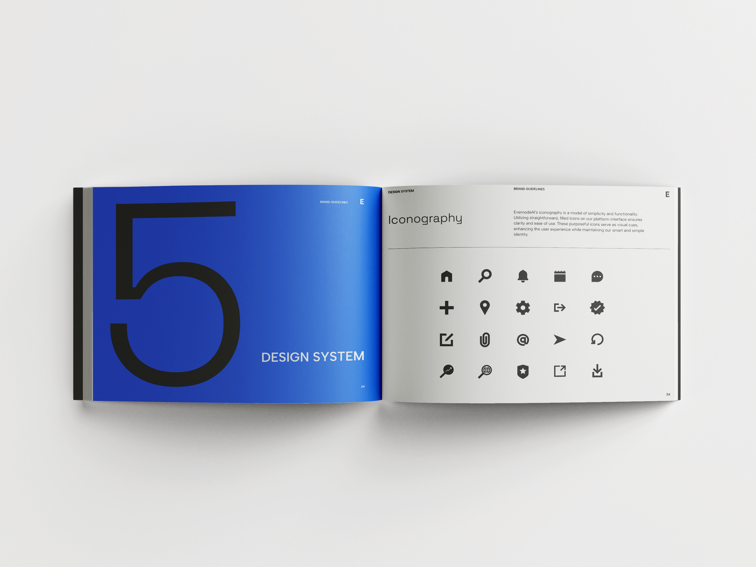
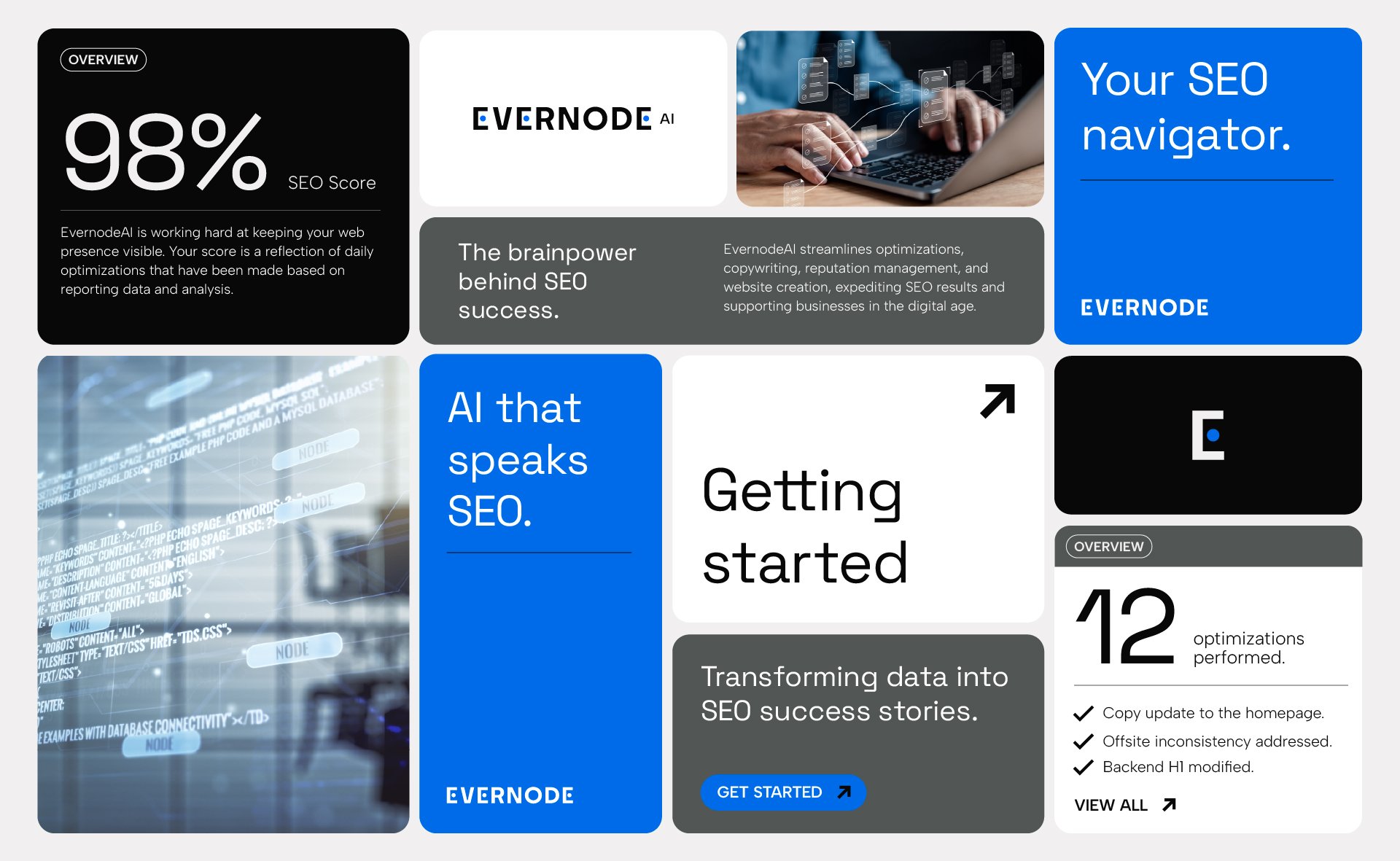
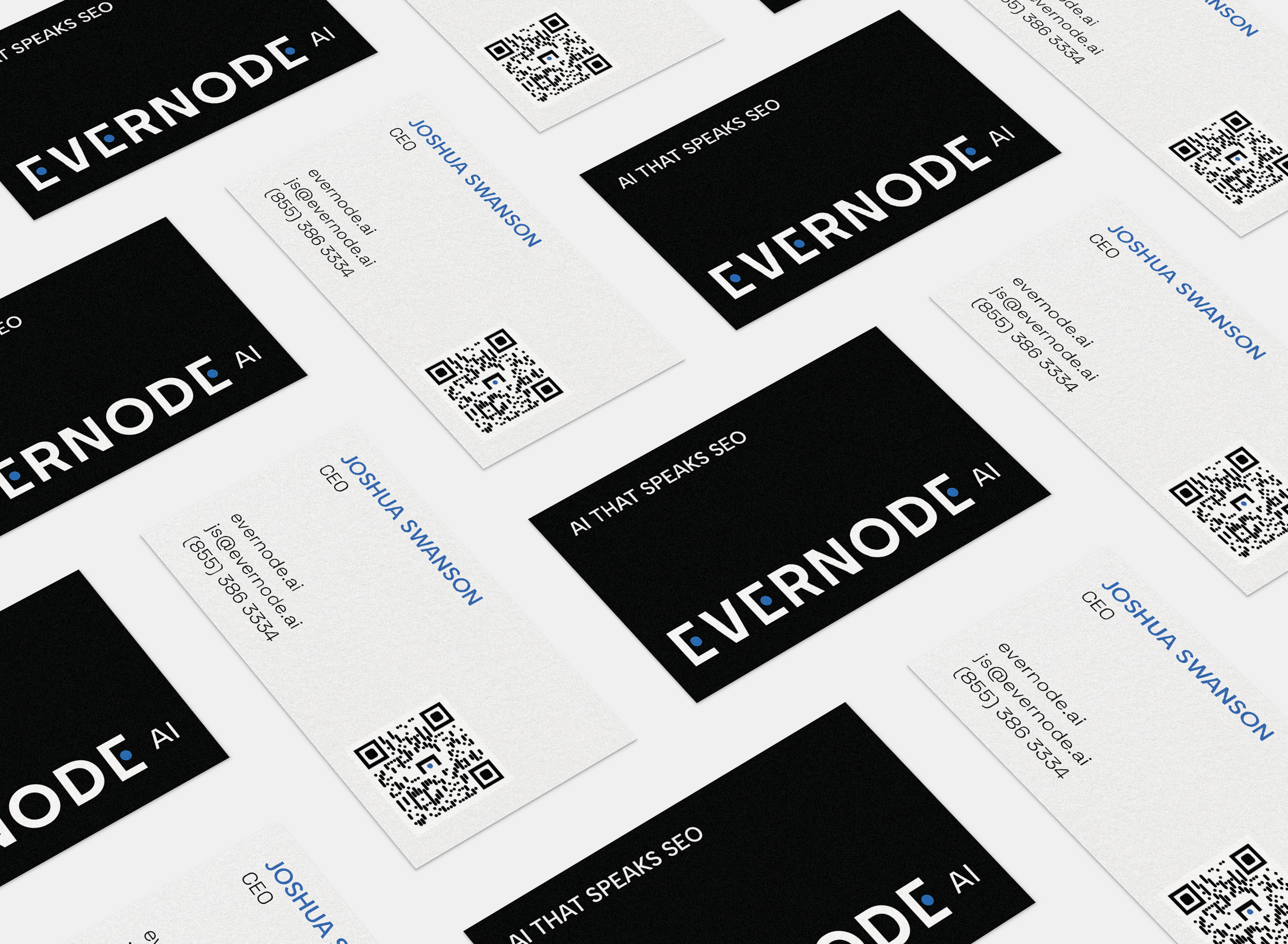
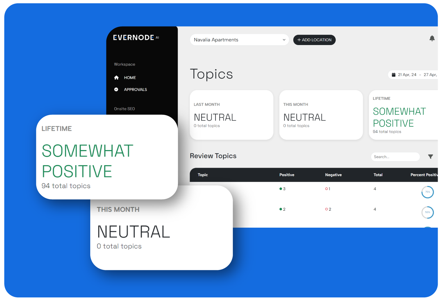
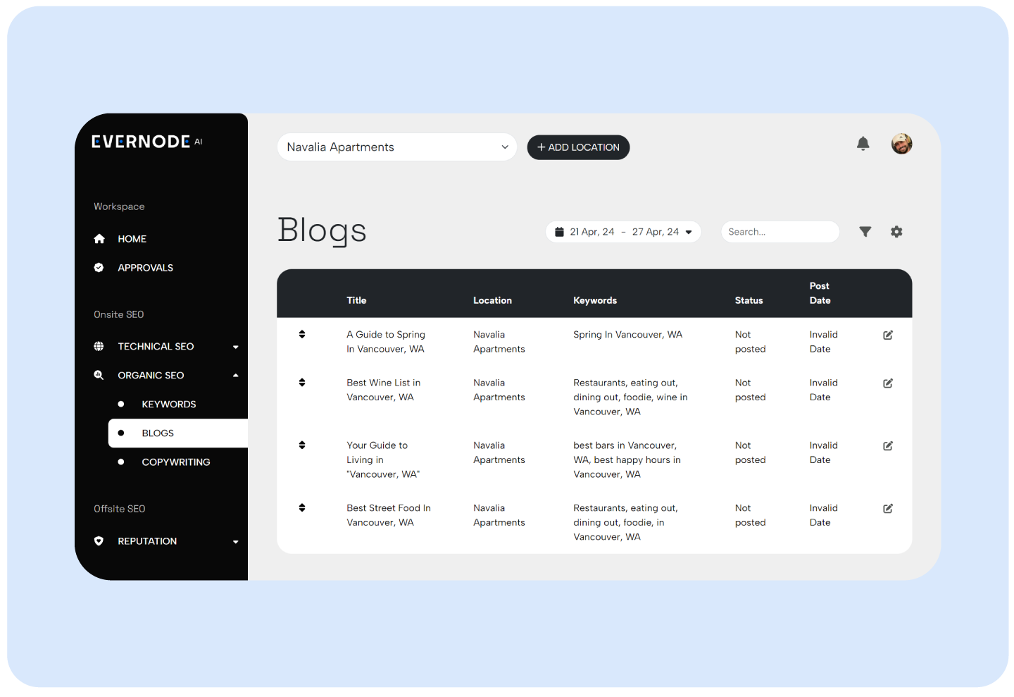
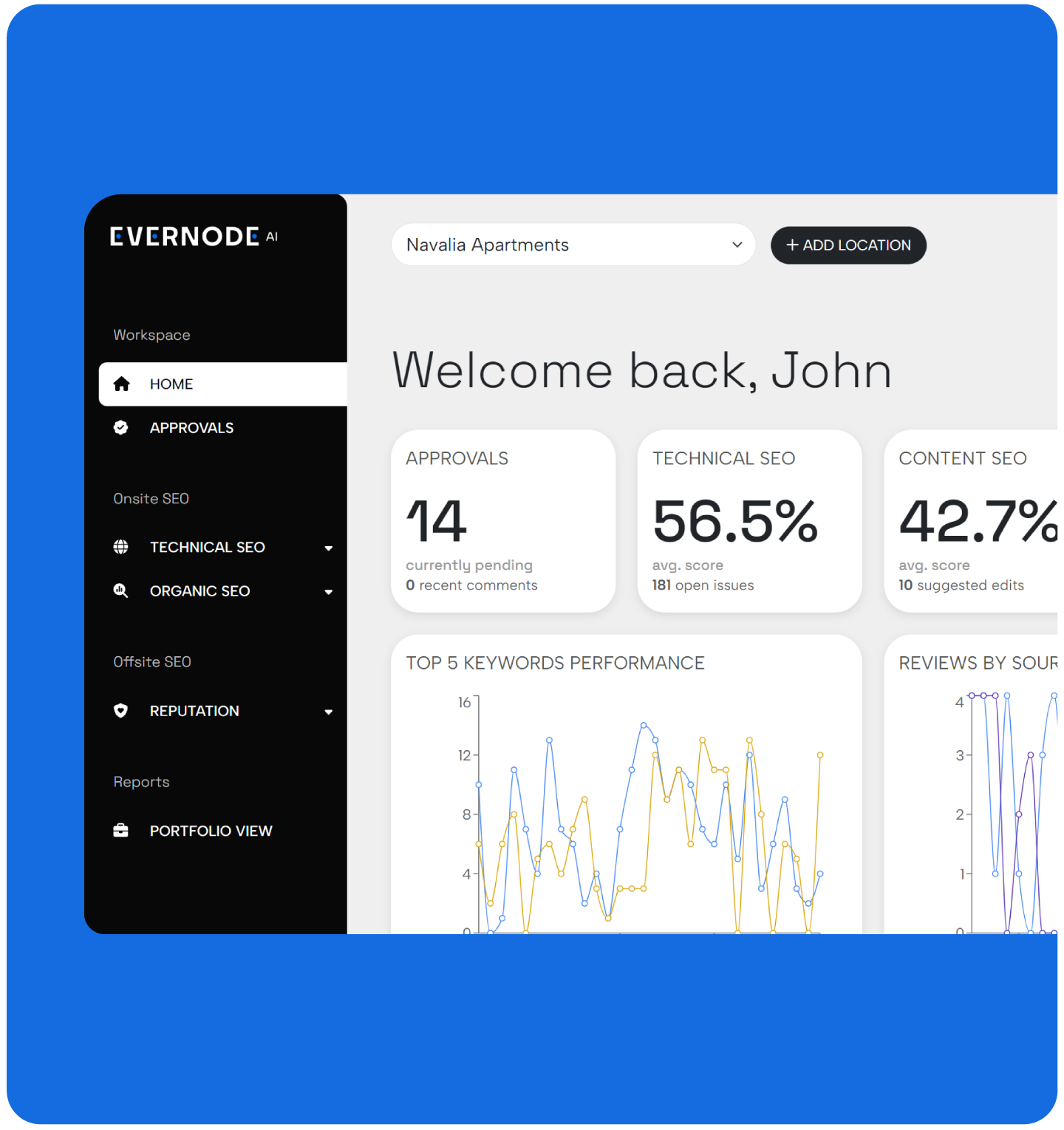
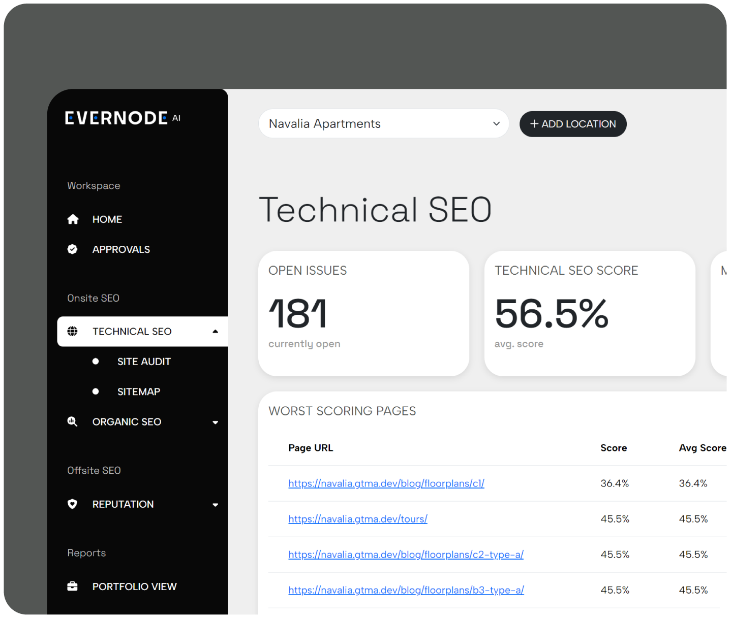
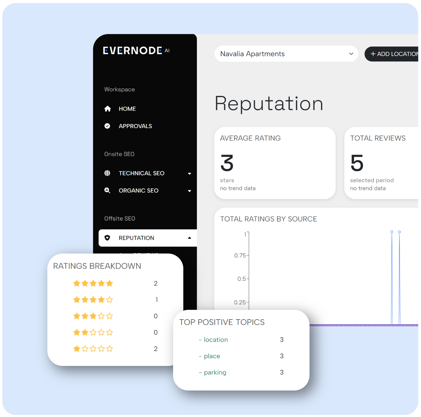
The logo is a modified logotype that uses an angular modern typeface and transforms the Es into “nodes” using circles and a pop of color. The resulting logo is minimal yet recognizable, and tells a succinct story through lettering. The color palette is lead by shades of gray and black, infused with a pop of electric blue. The palette is simple and modern, and translates well into the interface of our platform. Gray and black offer simplicity and maturity, while blue is considered the color of trust, intelligence, reliability, and authority. The typography system uses a combination of ultra-modern, tech-inspired sans-serif typefaces with angular details. They give a clear and smart tone to our brand voice. The design system for EvernodeAI uses modules of varying sizes and colors with rounded corners, uber-simplistic layouts, high-contrast typography, mix of thin and thick line, and simple iconography, creating an identity that is tech-forward, clean and user-friendly.


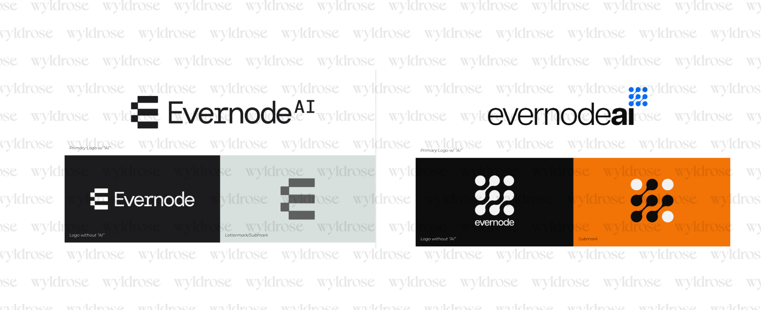
Unused Logo Concepts
